I received two separate emails recently sharing images and sample code for visualization projects produced with the help of Give Me My Data. I’m happy to share them both here:
Alex Hornbake posted a visualization mapping Facebook friend locations and connections in D3. You can view it here and there’s a Gist with all the code here. His image shows where his connections are located, or have move to or from. As abstract and beautiful as the image is, one can still make out a rough outline of the United States and even guess at specific cities like Atlanta, New York, Miami, and Los Angeles.
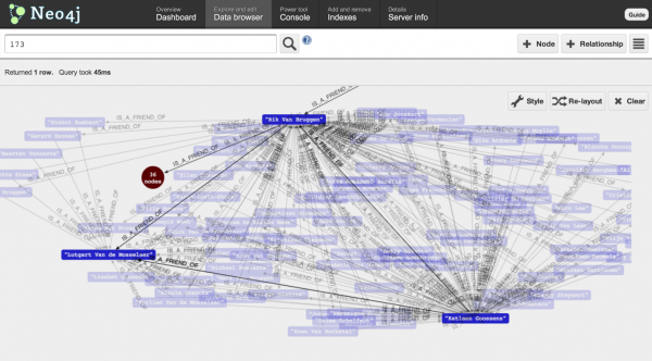
Rik Van Bruggen, of Neo Technology, used the “mutual friends graph” to create an interactive neo4j graph database. Following is more information from the tutorial he produced.
Ever since Facebook promoted its “graph search” methodology, lots of people in our industry have been waking up to the fact that graphs are über-cool. Thanks to the powerful query possibilities, people like Facebook, Twitter, LinkedIn, and let us not forget, Google have been providing us with some of the most amazing technologies. Specifically, the power of the “social network” is tempting many people to get their feet wet, and to start using graph technology. And they should: graphs are fantastic at storing, querying and exploiting social structures, stored in a graph database.
The first step to take was to get access to my own facebook data. Obviously there is the facebook graph api, but I hope that by now you would realise that is just not my cup of tea. Sounded to exhausting :) … So: I found myself a little tool that would allow me to download the data from facebook, in a workable format. Give me my data provides a number of different export options, but I chose the “Mutual Friends Network Graph – as it would give me most info with regards to my actual social network.

