Beautiful Data II @ Metalab at Harvard University

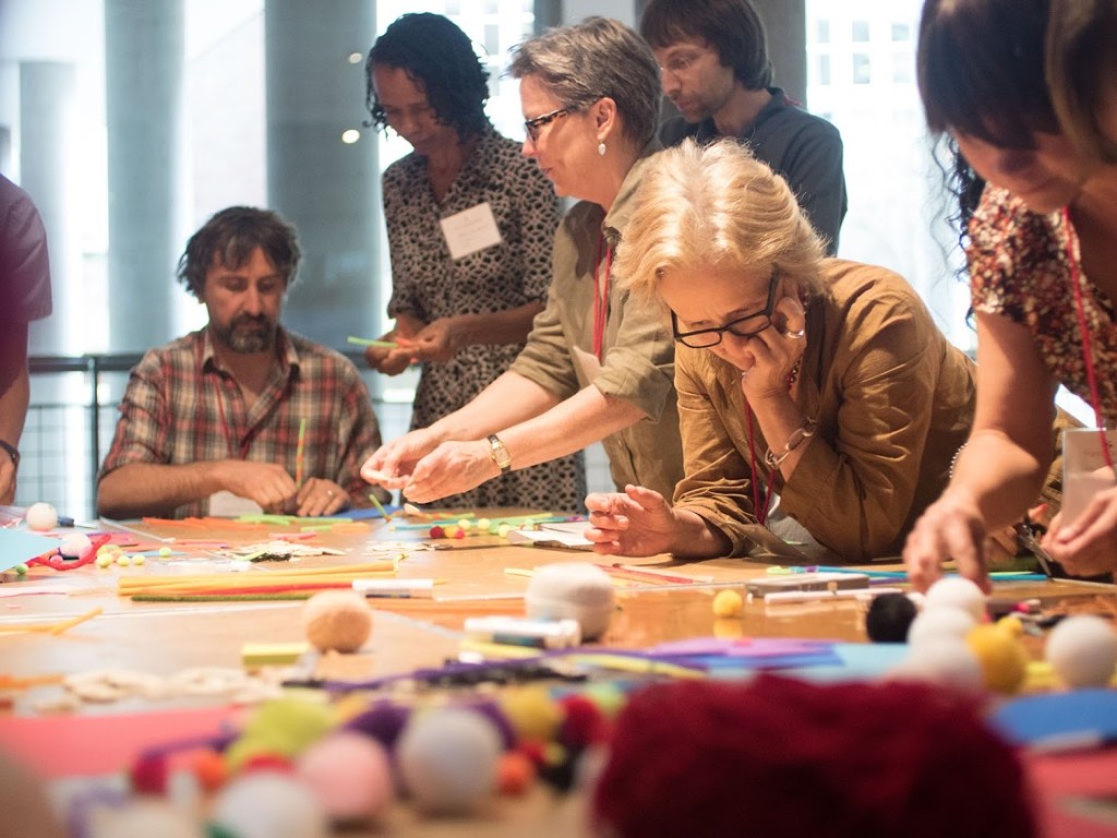
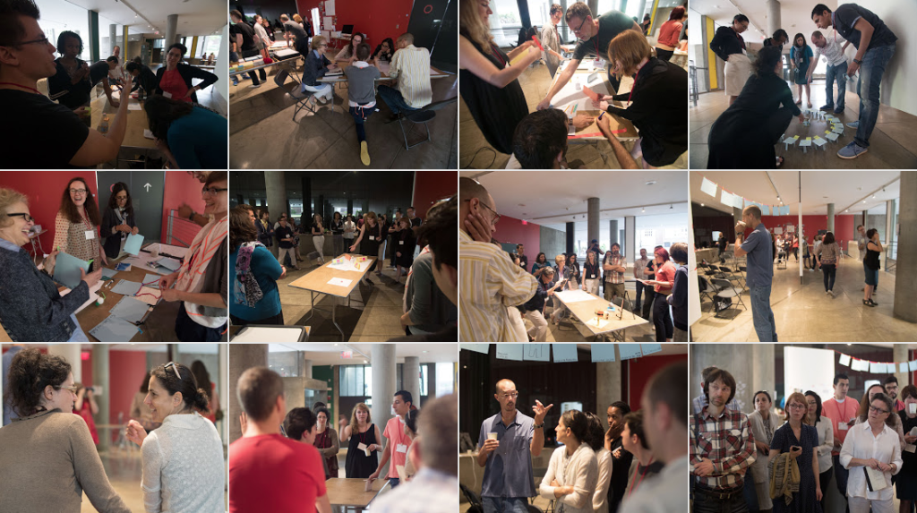
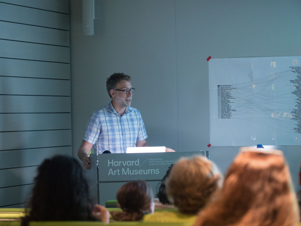
This month found me at the excellent Beautiful Data II workshop at the MetaLab at Harvard University sponsored by the Getty Foundation. Participants worked together in the Carpenter Center and Harvard Art Museum under the theme “Telling Stories About Art with Open Collections.”

Screen Shot 2015-08-01 at 7.03.00 PM

There were presentations by known visualization and museums experts, breakout sessions exploring how to represent problem data and collections, and talks by participants and Metalab staff and fellows, including a wonderful group of artists, curators, designers, and scholars in attendance.

Here are a few of the many highlights starting with this nerdy shot of me…
P1030056

P1000822
Data Therapy workshop with Rahul Bhargava (slides1, slides2).

Screen Shot 2015-08-04 at 8.18.09 PM
Learning about provenance at the Harvard Art Museum (note stamp declaring Nazi property)

This spanking cat statuette from the Cooper Hewitt collection.
Colour Lens produced at Beautiful Data I.
Presentation by Seb Chan Director of Digital at Cooper Hewitt.
Memory Slam by Nick Montfort.
Meow Met Chrome extension shows cats from the Met Museum in new tabs.

IMG_3966
Behind the scenes of Ivan Sigal‘s Karachi Circular Railway, Harvard Art Museum Lightbox.

The Life and Death of Data by Yanni Loukissas.
Ben Rubin discussing his and works by Mario Klingemann, Ryoji Ikeda, Jer Thorp and others.
William James Twitter Bot by Rachel Boyce.


Cold Storage documentary by Jeffrey Schnapp, Cristoforo Magliozzi, Matthew Battles, et al.

Cooper Hewitt Font Specimen
Cooper Hewitt typeface by Chester Jenkins


“Unicode” by Jörg Piringer shows all 49571 displayable characters in the unicode range.

*Most photos by Metalab staff

Upcoming workshop at FSU, “I Know Where Your Cat Lives”: The Process of Mapping Big Data for Inconspicuous Trends

I’m doing a workshop / lecture as part of the ongoing Digital Scholars digital humanities discussion group here at Florida State University. Workshop is free and open to the public.

Wednesday, March 25, 2:00-3:30 pm
Fine Arts Building (FAB) 320A [530 W. Call St. map]

Screen Shot 2014-10-29 at 4.32.37 PM

“I Know Where Your Cat Lives”: The Process of Mapping Big Data for Inconspicuous Trends

Big Data culture has its supporters and its skeptics, but it can have critical or aesthetic value even for those who are ambivalent. How is it possible, for example, to consider data as more than information — as the performance of particular behaviors, the practice of communal ideals, and the ethic motivating new media displays? Professor Owen Mundy from FSU’s College of Fine Arts invites us to take up these questions in a guided exploration of works of art that will highlight what he calls “inconspicuous trends.” Using the “I Know Where Your Cat Lives” project as a starting point, Professor Mundy will introduce us to the technical and design process for mapping big data in projects such as this one, showing us the various APIs (Application Program Interfaces) that are constructed to support them and considering the various ways we might want to visualize their results.

This session offers a hands-on demonstration and is designed with a low barrier of entry in mind. For those completely unfamiliar with APIs, this session will serve as a useful introduction, as Professor Mundy will walk us through the process of connecting to and retrieving live social media data from the Instagram API and rendering it using the Google Maps API. Participants should not worry if they do not have expertise in big data projects or are still learning the associated vocabulary. We come together to learn together, and all levels of skill will be accommodated, as will all attitudes and leanings. Desktop computers are installed in FAB 320A, but participants are welcome to bring their own laptops and wireless devices.

Participants are encouraged to read the following in advance of the meeting:

and to browse the following resources for press on Mundy’s project:

For further (future) reading:

I Know Where Your Cat Lives launched

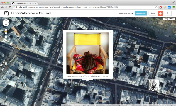
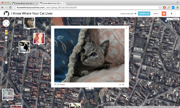
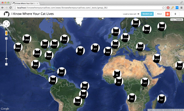
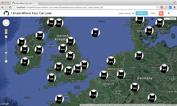
I just launched a new ongoing project this week. Here’s the text, a video and some screenshots. I’ll post more about how I made it soon.

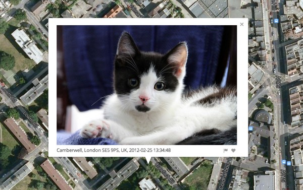
Welcome to the today’s internet—you can buy anything, every website is tracking your every move, and anywhere you look you find videos and images of cats. Currently, there are 15 million images tagged with the word “cat” on public image hosting sites, and daily thousands more are uploaded from unlimited positions on the globe.

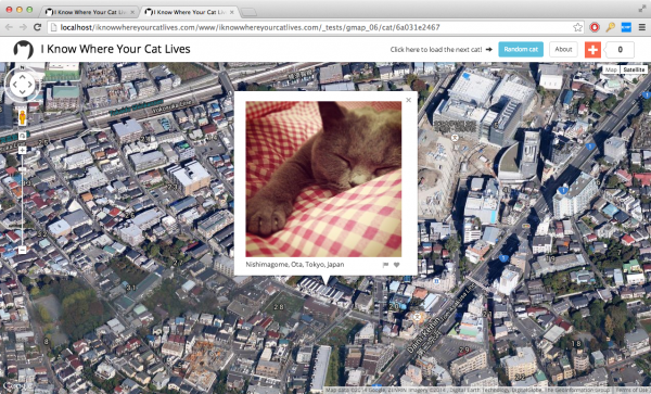
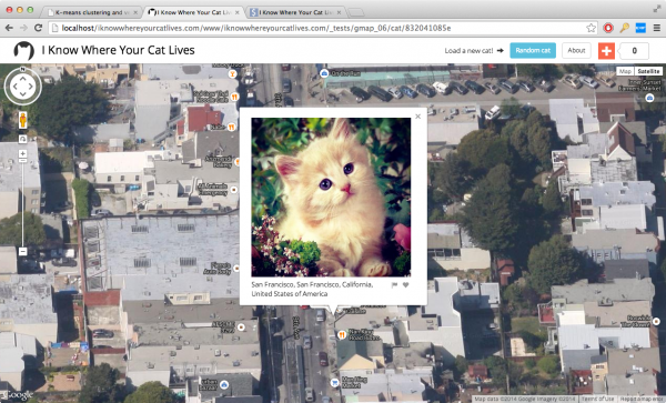
“I Know Where Your Cat Lives” iknowwhereyourcatlives.com is a data experiment that visualizes a sample of 1 million public pics of cats on a world map, locating them by the latitude and longitude coordinates embedded in their metadata. The cats were accessed via publicly available APIs provided by popular photo sharing websites. The photos were then run through various clustering algorithms using a supercomputer at Florida State University in order to represent the enormity of the data source.

This project explores two uses of the internet: the sociable and humorous appreciation of domesticated felines, and the status quo of personal data usage by startups and international megacorps who are riding the wave of decreased privacy for all. This website doesn’t visualize all of the cats on the net, only the ones that allow you to track where their owners have been.

Folks can also contribute to a kickstarter to help with hosting costs.

Screen Shot 2014-05-14 at 11.01.20 PM

Screen Shot 2014-05-14 at 11.06.09 PM

Screen Shot 2014-05-15 at 10.16.42 AM

Screen Shot 2014-05-23 at 8.48.02 PM

Screen Shot 2014-05-23 at 9.24.59 PM

Screen Shot 2014-06-05 at 10.28.53 AM

Screen Shot 2014-06-05 at 10.30.26 AM

“Data and Site: Visualizing Indexicality” lecture @ Florida State

Screen-Shot-2014-03-27-at-1.43.23-PM_cropped

I am giving a lecture on my research tomorrow at a Florida State Department of Geography colloquium. I’ll be addressing artistic and cultural works that make use of data visualization and various forms of mapping to critique or engage issues surrounding data privacy, militarism, and surveillance. I will be giving a preview of a new web-based project involving mapping and cats. I will also talk about Representing Place, the collaborative graduate seminar I co-taught with Prof. Phil Steinberg in Geography.

“Data and Site: Visualizing Indexicality”
Owen Mundy, Assistant Professor in Art
Friday April 18, 3:30-4:30pm
DeVoe Moore Conference Center, Bellamy 150-E.

Washington Post review of “Grid, Sequence Me” show + documentation

washingtonpost

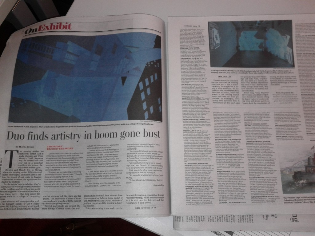
The Washington Post recently published a review recently about my and Joelle’s exhibition at Flashpoint Gallery in D.C. Check it out: Joelle Dietrick & Owen Mundy: Grid, Sequence Me, by Maura Judkis, Jan 11, 2013.

A few elements will be recognizable, such as the brutalist outline of the J. Edgar Hoover FBI Building, but many are stripped down to their most generic shapes, making rows of windows look like charts and bar graphs. The projections of some of those shapes echo and interplay with the forms of the Flashpoint gallery interior.

Dietrick and Mundy also scraped The Post’s listings of recent home sales, with architectural elements from some of those homes appearing before a dense thicket of live-streamed code. It’s a visual reminder of just how complicated the housing industry has become.

There’s a sense in the animation that the structures are tumbling away from you — just as homeownership has slipped out of the grip of many Americans. But the piece will elicit a different reaction here than in Florida, where the effects of the housing market crash have been far more pronounced. In Washington, we’ve mostly been insulated from it: Foreclosures are few, short sales are sparse. In the jumble of buildings and code, “Grid, Sequence Me,” may serve as a warning for those who haven’t experienced that sense of loss — but who indirectly, though policy work, may have influenced the systems that led to the crash.

I also finished a short piece with video from the installation and screen captures of the Processing visualization.

Packet Switching project: ColladaFragmenter software, Kassel, Germany and University of Florida Public Commission

Joelle Dietrick and I embarked on a new body of work this summer called “Packet Switching.” Inspired by her Sherwin Series images and wall paintings, and my work deconstructing and re-visualizing source code and other data, we’ve created two new software projects, as well as a series of limited edition prints, large photo installations, wall-sized paintings, and animations.

The full statement explains our process and intent clearly:

Packet Switching is an ongoing body of work by Joelle Dietrick and Owen Mundy that visualizes architecture as fragments affected by economic and communications systems.

The title of the series references how contemporary communications systems break digital files into smaller manageable blocks of data called packets. Each packet is then sent through a network, taking the quickest route possible, and reassembled once they reach their destination. One JPG image, for example, might be broken into several packets, each of which may travel a different path through the net, even through different cities, before being recompiled into a copy of the original file.

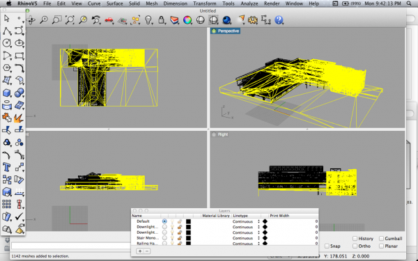
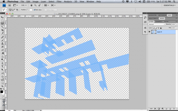
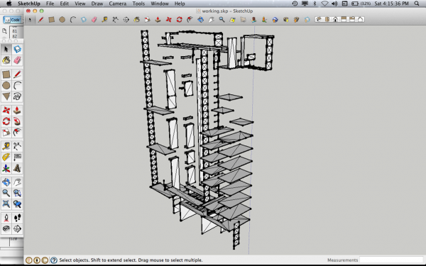
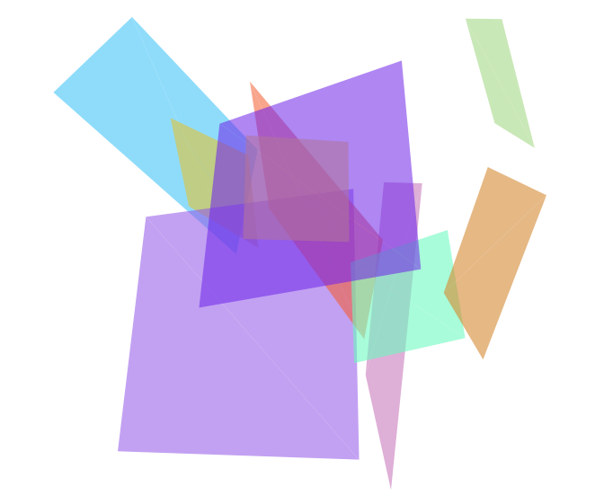
To reference this common process used in networked systems, we wrote custom software that deconstructs a 3D model’s source code and produces unique fragments. We further remixed these fragments using an original application created in Processing. The resulting images become limited edition prints, large photo installations, wall-sized paintings, and animations.

Our process underscores how incidental fragmentation and automation can streamline markets, but also make them vulnerable to systems failure. The use of architecture specifically points to recent real estate market volatility and considers how communication technology-enabled pursuits of profit margins alters our most basic needs.

The first software, that “deconstructs a 3D model’s source code and produces unique fragments,” is open source and available on Github. Essentially, the PHP software, parses a 3D COLLADA file and exports a set number of geometries, that can then be further broken down and used in an artwork or design.

The second software, which we will release soon, remixes these fragments using Processing. The video below shows an example of the whole process.

Wall painting at “Temporary Home” in Kassel, Germany

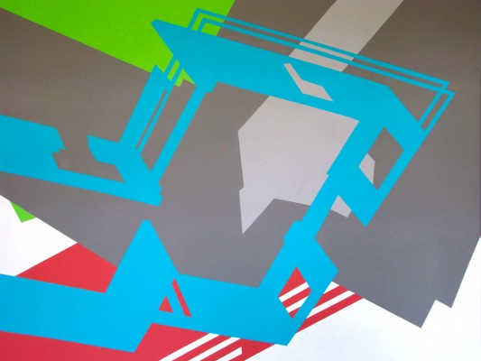
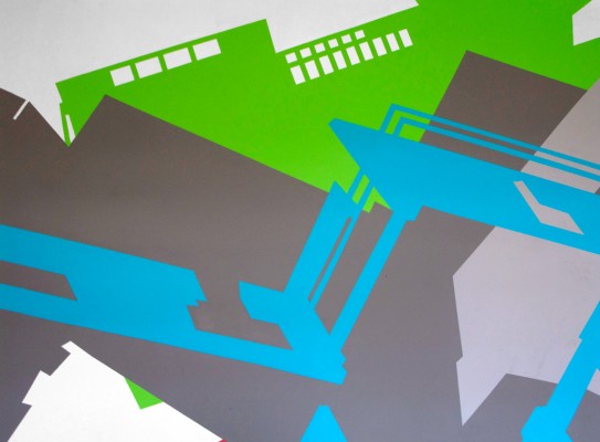
While artists-in-residence at Temporary Home, in Kassel, Germany, which coincided with Documenta13, Joelle Dietrick and I completed a wall-sized temporary painting based on the architecture from the Bauhaus School at Dessau and 2012 American color forecasts.

Commission at Weimer Hall at the University of Florida

Joelle and I have also received a commission to complete Packet Switching (Weimer Hall) at the University of Florida College of Journalism and Communications this fall. This will be inkjet on adhesive polyester on a large wall (approx. 177.5 ft. x 20.2 ft.). More details soon.

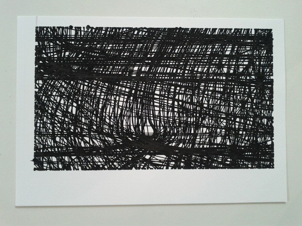
New line plotter prints of I Am Unable to Fulfill Your Wish

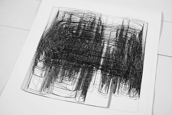
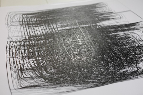
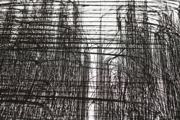
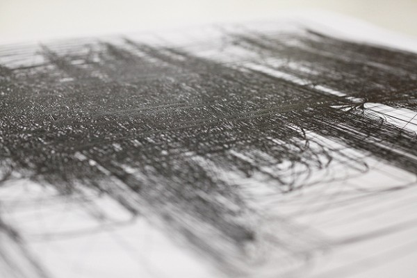
Here are some images Ryan Boatright of Atelier Boba made while he was printing one of my network visualizations from the I Am Unable to Fulfill Your Wish series on their new line plotter. The prints arrived last week from their location in Paris and are great to see in person. The line plotter repeated so many of the lines it actually polished the surface of the paper causing the print to reflect light.

Processing.js – Missing Documentation

The Processing.js project is really cool. It allows you to run Processing .pde files inside (HTML5 compatible) web browsers using Javascript. You can pass data back and forth between the two programs, access the DOM with Processing, and you don’t need any plugins or Java.

Click here to run this Processing sketch in your browser

One caveat… When importing a Processing .pde file into the HTML5 canvas you must access the files on a web server or by using localhost (a server running on your computer, e.g. MAMP) because most (all modern?) web browsers don’t allow file:/// access for security reasons. Unfortunately this is not intuitive as Javascript should run in the browser regardless of file:/// access. Nor is it mentioned in any of the Processing.js Quick Start documentation. I found it by testing, and then confirmed it in their README. Darn, need to remember to read (all of) the instructions.

UPDATE: A friend pointed out that the problem accessing the .pde file could be due to the same origin policy. Though not explicitly stated on the Github page for Processing.js, they do mention that disabling same origin setting in your browser is a(n undesirable) workaround.

Some web browsers (e.g., Chrome) require secondary files to be loaded from a web server for security reasons. This means loading a web page that references a Processing.js sketch in a file via a file:/// URL vs. http:// will fail. You are particularly likely to run into this problem when you try to view your webpage directly from file, as this makes all relatively links file:/// links.

-->